

The grizzled, washed-up old hacks that compile this column are taking bets on how long one of the worst examples they’ve ever seen of a total visual graphic design fuckup on any media platform – print or electronic – will last.
They are referring to the recent decision by Channel 9 News in at least Brisbane and Sydney to share with viewers a totally unhelpful map of where the next news item is coming from. We didn’t check Melbourne; who cares what happens down there.
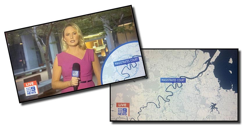
At right above is the full-screen image from Channel Nine’s news out of Brissie last night showing unexactly where the Brisbane Magistrates Court is! If your car doesn’t have sat-nav and you need to travel to those courts in the Brisbane CBD any time soon, simply print out that image and you won’t be there before you know it.
When the vision then crosses to the reporter at the courts, the totally useless map is shown once more (at left, at top), proving the courts are midway along some squiggly line thingo.
Another recent example of this stupid concept on Nine’s Brisbane’s news was the map to show that the Queensland government’s nemesis and Nine state politics reporter Tim Arvier was in Townsville. Largely useless to anyone who can’t see Castle Hill from their verandah.
Look, maybe the clown who thought up this imagery for the network did so to reinforce, on the Brisbane example, the point that the scribe was indeed at the courts. We can see that anyway.
The whole idea is a joke and a waste of time and the MGH hacks suspect the idea will have been axed by week’s end, if not tonight if those in charge of Nine’s news divisions up at Mount Coot-tha and in North Sydney have any sense.
The MGH hasn’t seen such a botched idea for a media platform image since another clown at The Courier-Mail way back when thought they had some graphics arts talent and redesigned the look of the LNP publicity tabloid put together at the LNP’s Bowen Hills branch.
Each and every page was dark and brooding and visually vomitous, with 60-point reverse strap column titles often as large as the major headings below them, often also reversed out. It was a shocking one-day wonder it lasted so long.
The concept was quickly axed as the paper’s printery down at Murarrie kept running out of black ink and angry newsagents complained because they couldn’t afford the amount of soap needed to wash their hands clean after handling just one copy.
EDITOR’S NOTE: These map location visuals are probably not a good idea for another reason: Nine News in Brisbane should be a bit more wary of identifying their reporters’ locations given they were exposed a few years back claiming their reporter in a chopper was in the air over Caboolture when it was hovering just off Mt Coot-tha!
***
If any of you BUGgers out there can make sense of this pointer on the home page of today’s Sydney Morning Herald, please drop us an email and explain it to us.
Oh, okay, we’ve read the full story and we appreciate it sort of makes sense. We just thought on the surface – which is not generally where subs are – it looked a tad contradictory and silly. Or is it just our weird sense of humour? Don’t answer that question!!!
Want to be alerted immediately a new blog hits Australia’s longest running and most offensive satire site? Simply click on the Follow sign or the link below to be emailed new yarns the moment they are uploaded! The very second we go far too far – and trust us we will – you can then quickly unfollow via the three dots!
